
In this case Context Challenge Process Solution Results
Seller's Catalog
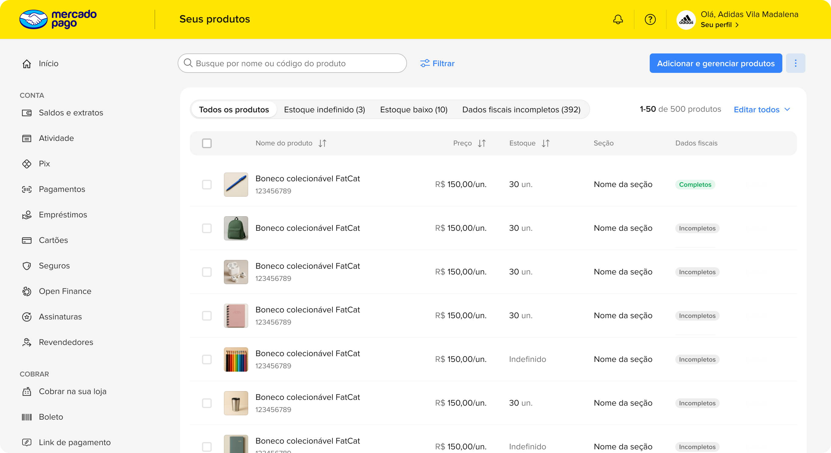
Catalog Revamp — final product
Revamp.

Not Mercado Livre,
but Mercado Pago

How did we get here?

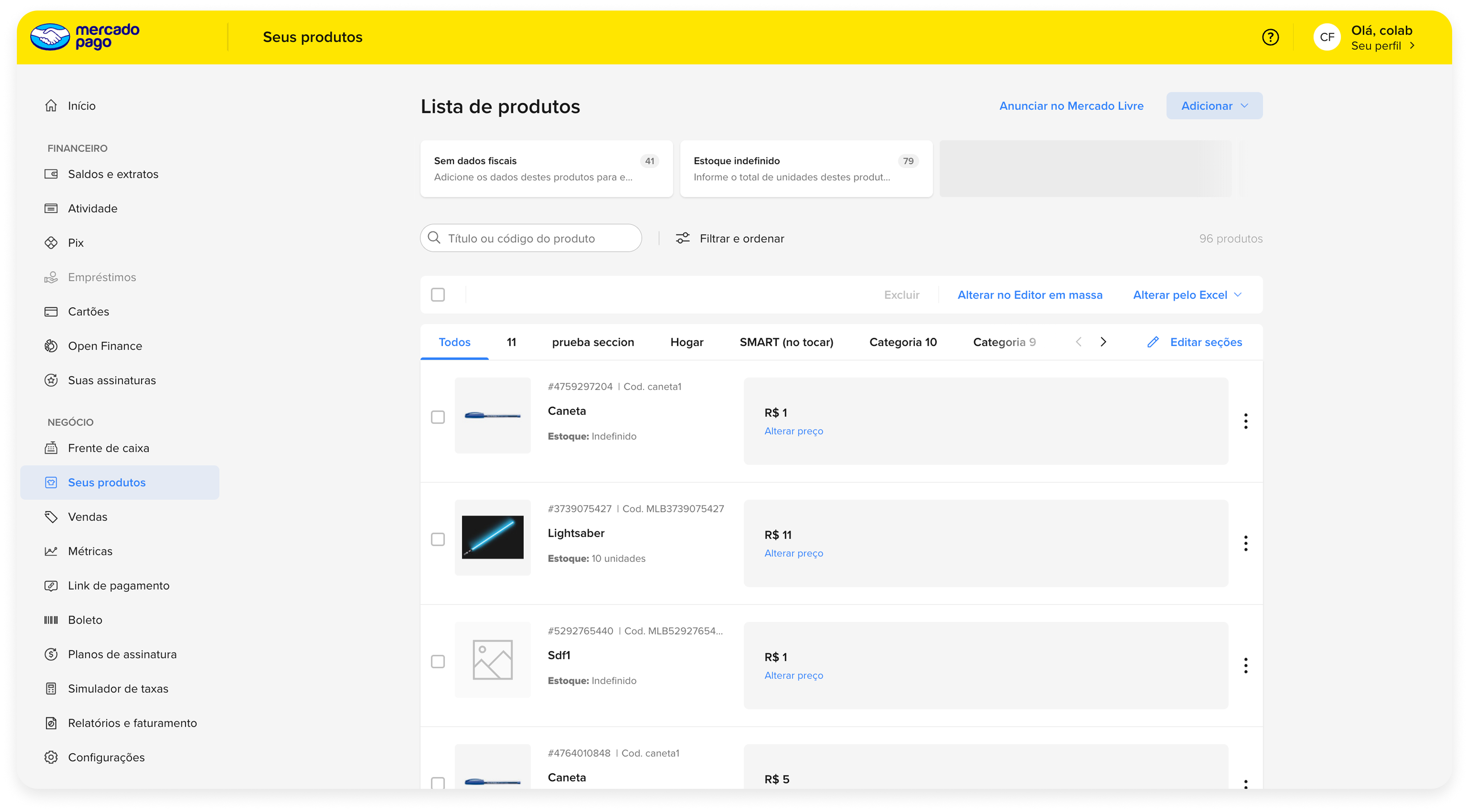
Mercado Pago's product listing was heavily dependent on the marketplace infrastructure, making the solution inflexible and misaligned with the specific needs of sellers — since these are distinct user profiles and most Mercado Pago users rely on it exclusively as a payment tool, without selling on the marketplace.

What did we see?

The average volume of cataloged products was below expectations. To improve the situation and stimulate tool usage, it became necessary to separate the Mercado Pago user from the Mercado Livre user — so we could understand their own needs and pain points and steer the product in a targeted direction.

How we decided to solve it

The product needed to be redesigned from scratch to serve sellers managing dozens or hundreds of products — surfacing each feature at the right moment, presenting them contextually and conveniently, and reducing cognitive load for those handling large catalogs.
Scope

MLB and MLM sites
Desktop, Tablet and Mobile

My role

UX Designer • working with +1 UX Designer, IT, Product and Project Leader

Relevant data

Average of 34 products registered per month on MLB and 100 on MLM

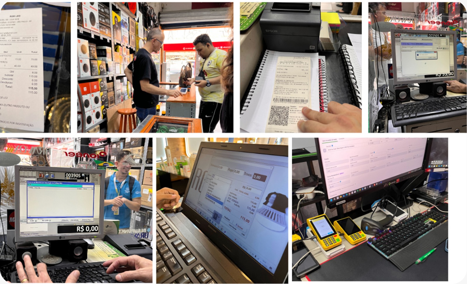
Field visit with sellers
Who are our users?

We conducted field visits to closely understand sellers' day-to-day routines and map their main pain points. From this immersion, we ran a collaborative opportunity mapping — turning direct observations into concrete directions for the redesign.

What was the process?

We followed the Double Diamond — from ideation to delivery, in constant alignment with Product, IT and technical leadership.

01 Field research
02 Analysis and benchmarking
03 Concept and wireframes
04 High-fidelity refinement
05 Usability testing
06 Tracking and results

From opportunity to solution

Click the dots on the image to explore opportunities and improvements
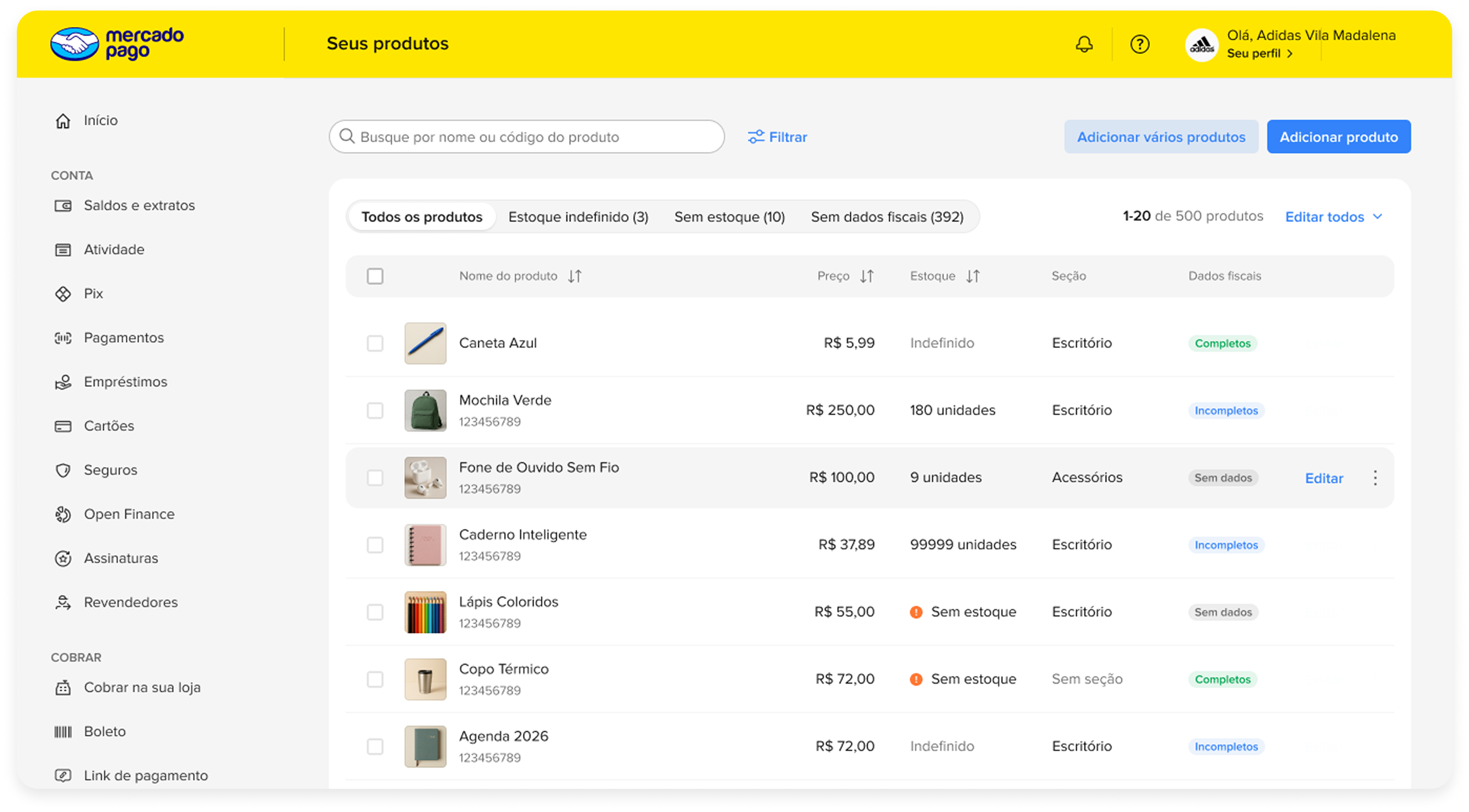
Before
Product listing before the revamp
ProblemThe 'pending alerts' area weighs heavily on the screen and feels disconnected from the product list.
ProblemWhen there are fewer than three cards, a placeholder is shown instead.
ProblemAccording to the metrics analyzed, only 27% of sellers created items with sections in the last three months. That space could be better used for a feature that serves a larger share of users.
ProblemProducts are displayed in a card format with a large white space that could be better used to organize actionable items and information.

Product listing before the revamp

After
Alerts as tabs, product table and add actions
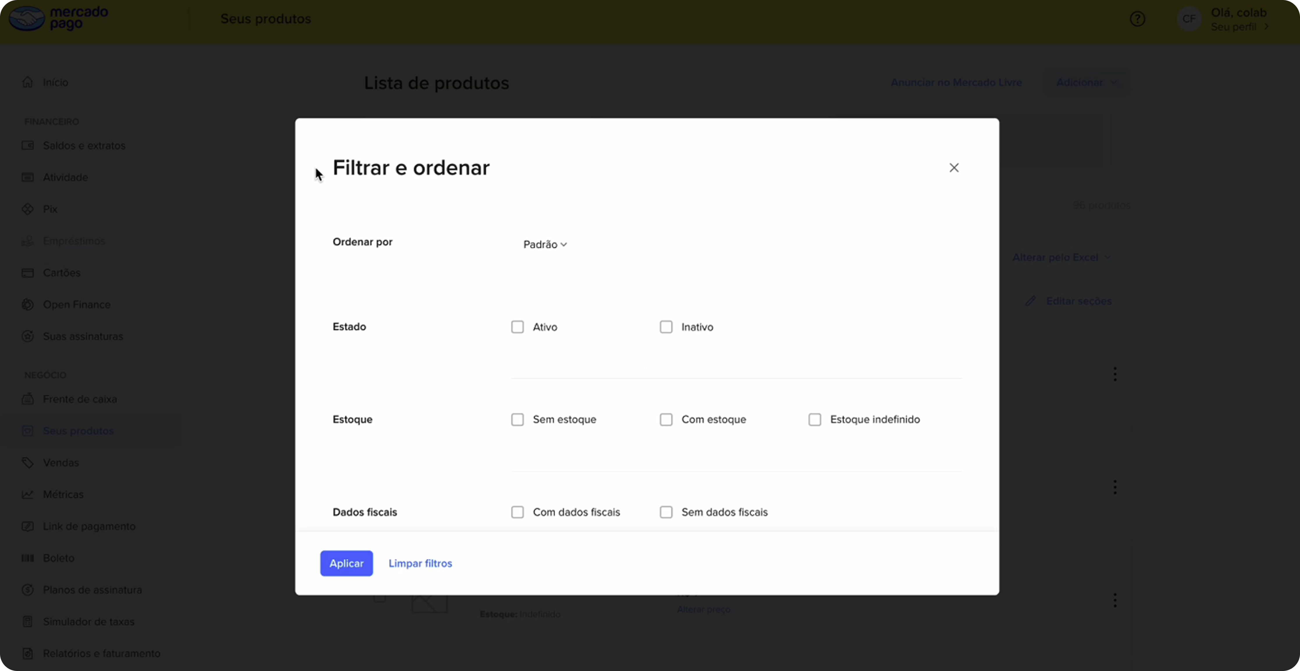
ImprovementThe Section column now integrates that information directly into the table, reclaiming the space previously dedicated to section navigation — used by only 27% of sellers.
ImprovementThe pending-items area was reorganized as tabs that segment products, enabling a simpler and more direct view — connected directly to the listing, without taking up too much space or stealing focus from the screen.
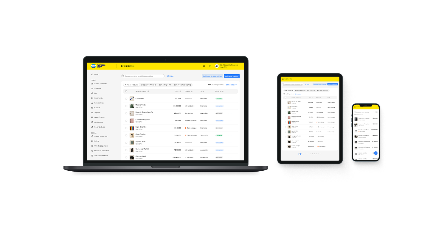
ImprovementItems are now displayed in a table-like format already familiar to most sellers. The format also helps visualize more items at once, making comparison and management easier.
ImprovementThe choice to add one or two products is surfaced upfront, removing the need for a dropdown button.
ImprovementSince the filter includes a fiscal-data status option, that information was added to the table, reinforcing the invoicing feature.
ImprovementTo avoid overload, edit and delete options are shown only on row hover.

Alerts as tabs, product table and add actions

Before
Filters in a modal — user loses screen context
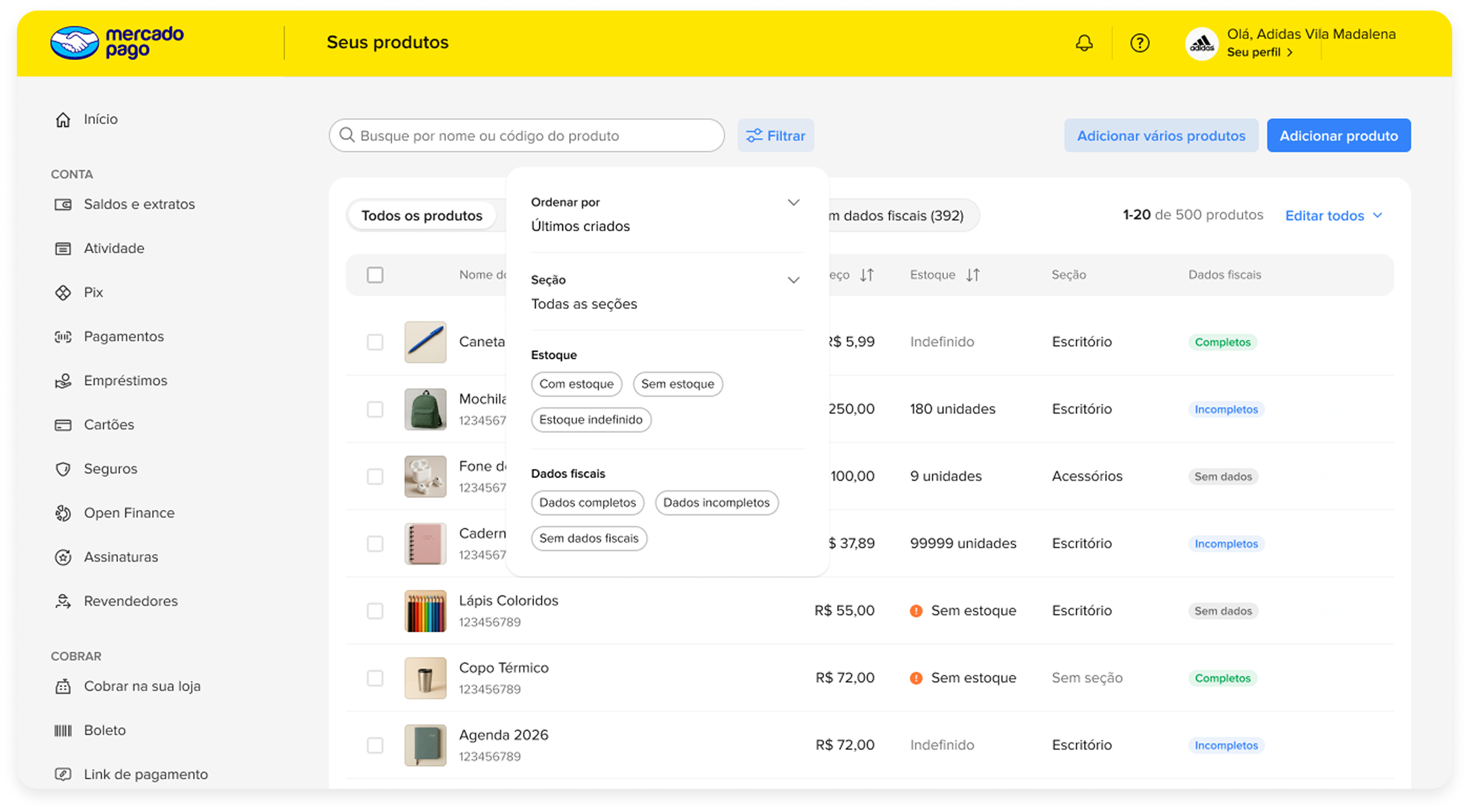
ProblemThe modal filter format pulls users away from the main page flow, creating a more disruptive and less fluid experience.

Filters in a modal — user loses screen context

After
Filters integrated into navigation, no modal
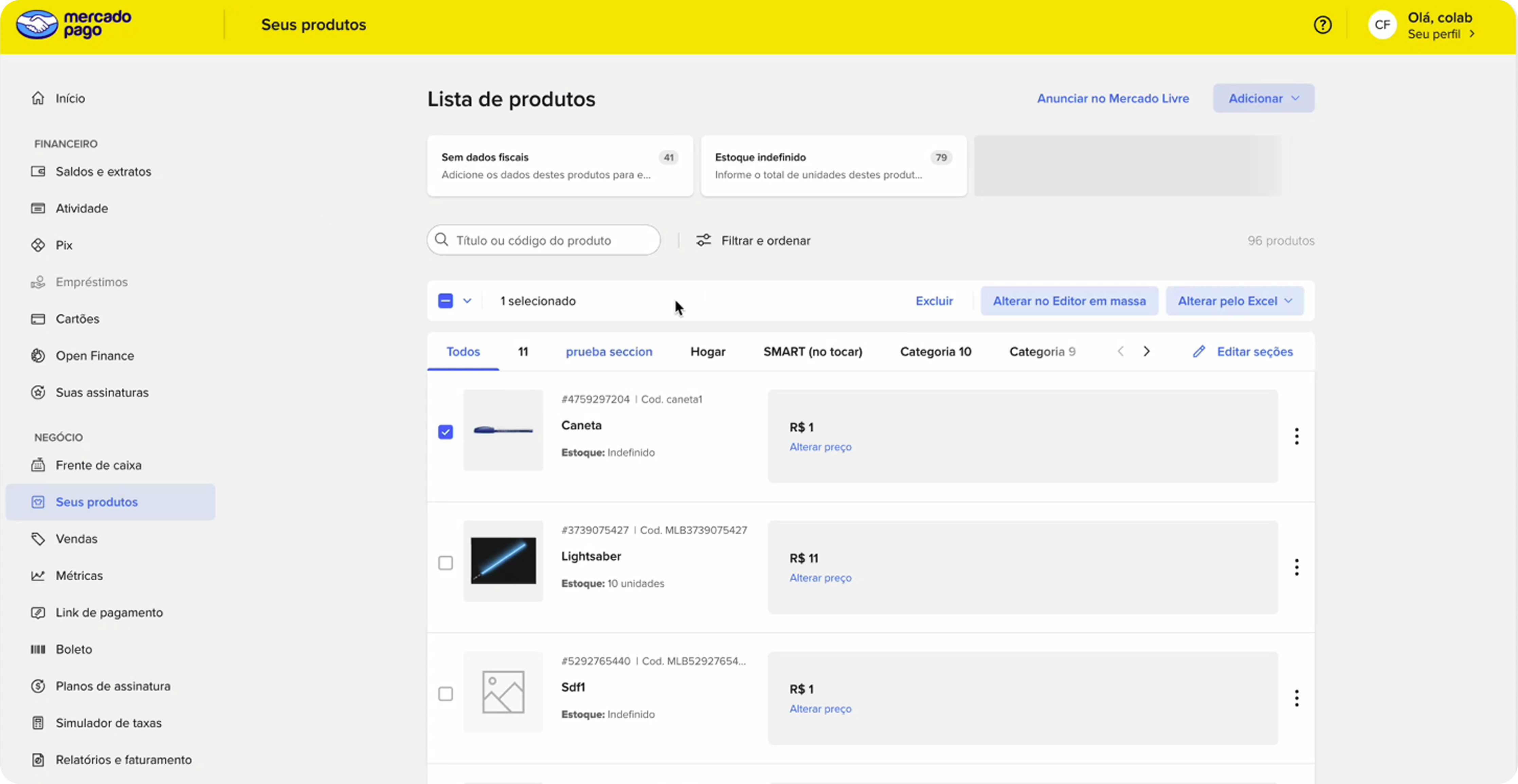
ImprovementFilters are now displayed in a less intrusive way, integrated into the navigation experience, ensuring more fluidity and less interruption while using the page.
ImprovementColumn sorting to make management easier.

Filters integrated into navigation, no modal

Before
Selection always visible, no emphasis on bulk actions
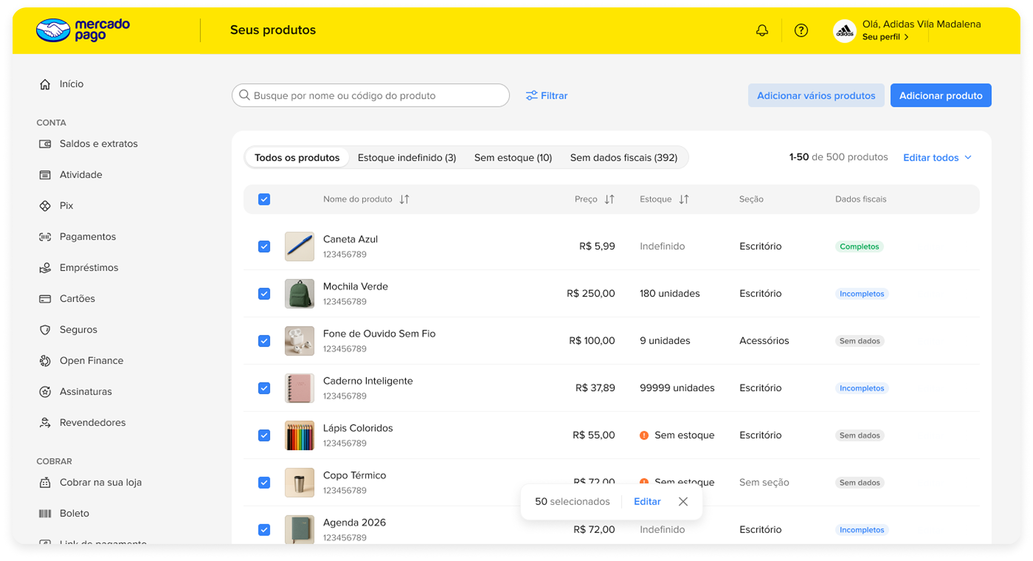
ProblemBulk actions can be shown after a first user selection to avoid cognitive overload.

Selection always visible, no emphasis on bulk actions

After
Contextual bulk selection and actions
ImprovementBulk actions are now shown only after a first user interaction (selection), reducing visual clutter on the screen.

Contextual bulk selection and actions

Devices
What were the real-world impacts?

Launched in November.
Consistent growth in the months that followed.

The project went live in November 2025. The data below shows the direction of impact in the first months post-launch on MLM and MLB — with consistent growth in the volume of items created and the base of active sellers.

Pre-launch · Oct 2025 · MLM ~800 sellers · 77 items/seller · ~62k items/month
+49% items created MoM in December — first full month post-launch. Growth maintained: 163k in January and 205k in February MLM
+30% AVG items per seller: from 77 in October to 100 in December MLM
+112% sellers creating items: from 800 in October to 1.7k in January — holding at 2.1k in February MLM
+90% active sellers in Q1 post-launch: from 1k in January to 1.9k in March MLB

MLM · Oct 2025–Feb 2026 · MLB · Jan–Mar 2026 · directional data