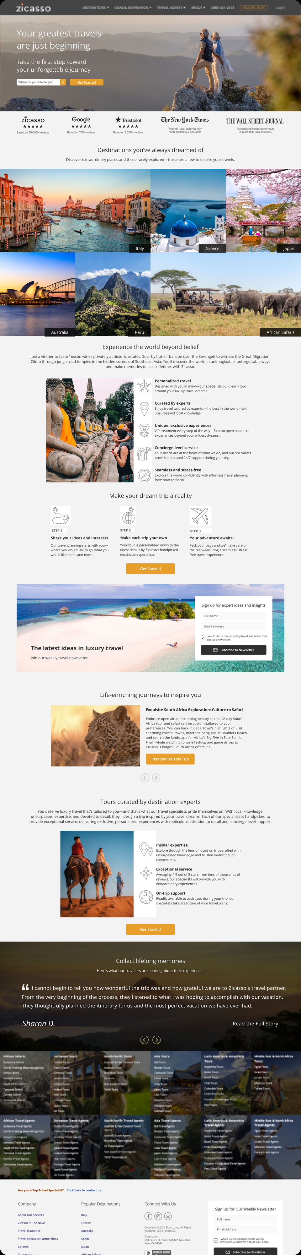
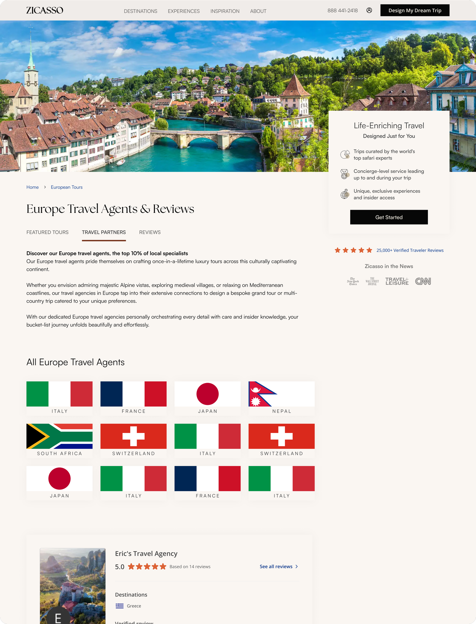
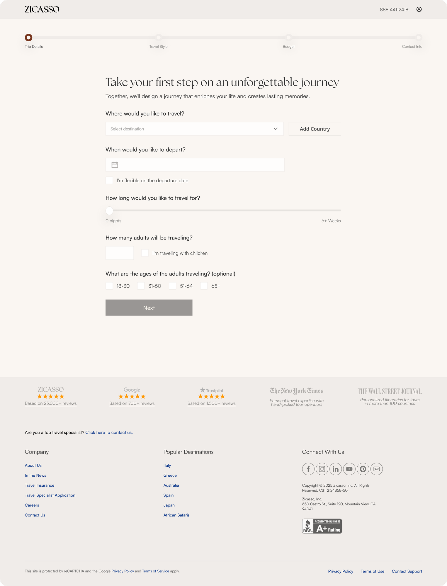
Zicasso is a luxury travel company going through a brand repositioning. Its public website needed a more refined, premium, and trustworthy experience that better reflected the complexity and personalization of its travel offering.
Benchmarking of competitors and luxury brands, performance data from existing PPC (pay-per-click) landing pages showed how users were actually behaving, guiding the way to four clear attributes for our new website.
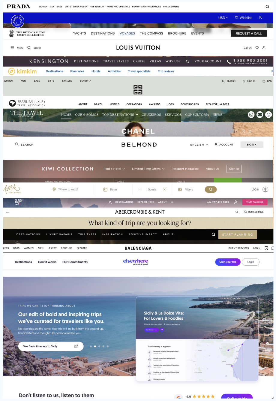
We looked not only at competitors actively repositioning around luxury and lifestyle, but also at luxury brands outside the travel industry — which led us to pursue an editorial, sharp, and confident website, one that matched perfectly with the rebrand made by the Marketing team.
Less is more. Longer landing pages consistently saw higher drop-off. Pages with 8+ sections, and even individual sections with too much content, were more likely to lose users.
Luxury was already resonating. "Premier" and "Luxury" content consistently drove engagement, confirming that these themes aligned with what users were looking for.
Consistency mattered. Landing pages using components more closely aligned with the new visual direction — including colors and card patterns — performed better.
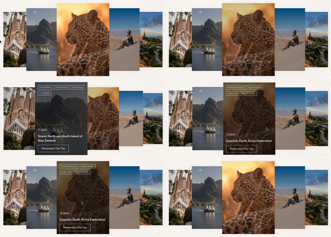
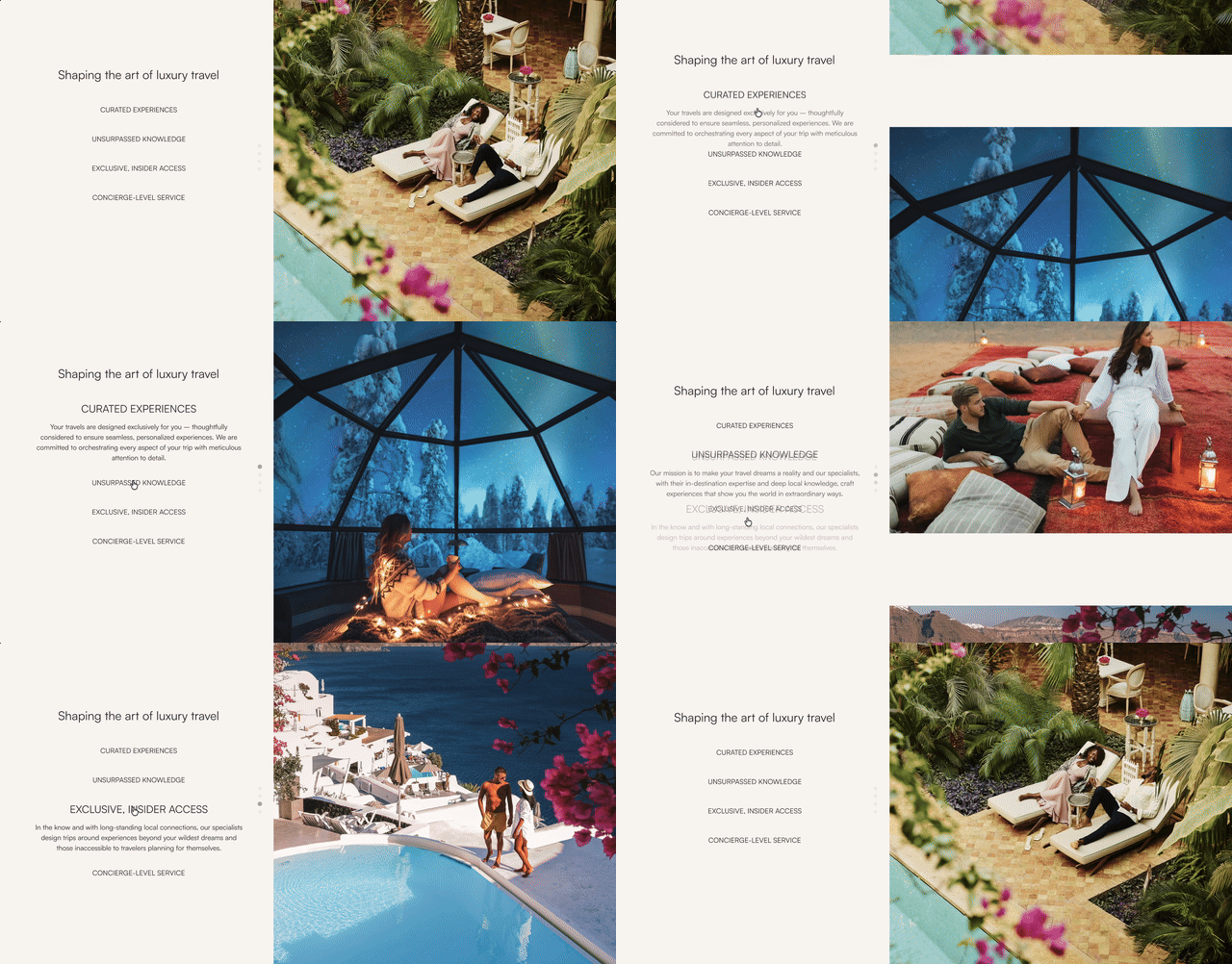
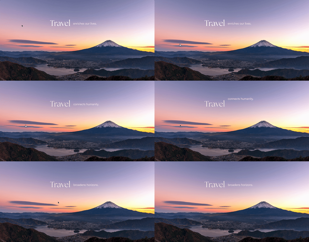
Benchmarking showed luxury brands leaning hard into photography, video, and motion to feel aspirational, not just informative. We did the same — with more imagery of travelers, not just destinations, so people could picture themselves in these experiences.
Finding 01 was direct: longer, denser pages lost engagement. The new system prioritized clearer hierarchy, fewer competing elements, and content chosen for relevance over volume.
Finding 02 showed generic travel content underperforming next to "Premier" and "Luxury" framing. Content adapted based on entry point and search intent, keeping the focus on what a Zicasso trip specifically offers.
Mobile already represented the largest share of traffic. Responsive behavior and performance were considered from the beginning — while still designing for a significant desktop audience.
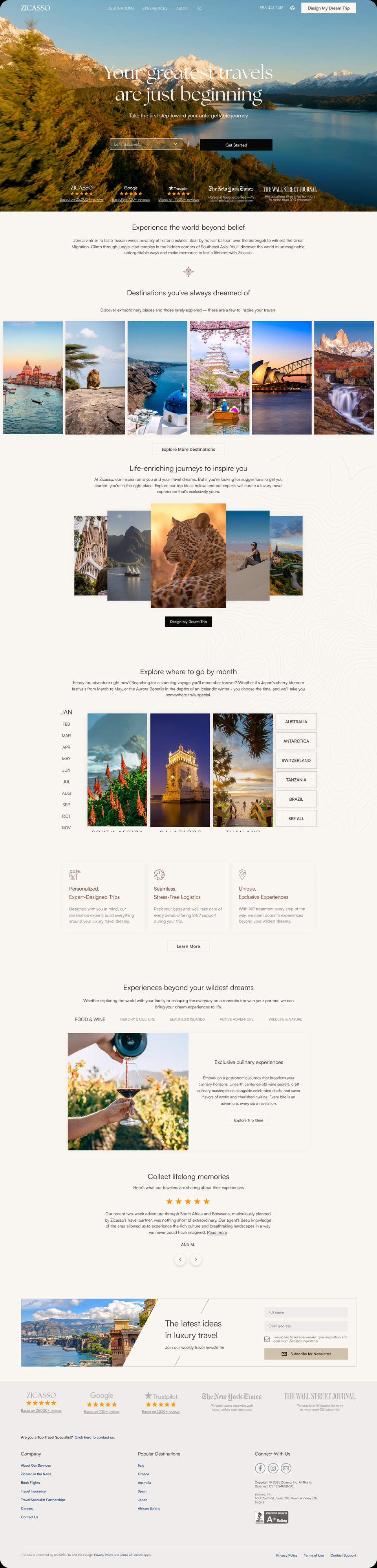
The homepage went through a lot of iteration before we landed on the final version. Nothing here shipped simply because it looked right.
From a denser, promotional layout to an editorial one built around hierarchy and restraint.
Used to guide attention, reinforce the new brand, and make transitions feel natural.


After launch, I ran a moderated usability test comparing the old homepage with the new one — 5 users per version, with 3 questions each.
Participants were screened to match Zicasso's actual customer profile: US-based, ages 40–88, post-graduate, household income over $100K, and experienced travelers.
Given the scope, the rebuild shipped in phases rather than all at once.
Copy, placement, and image changes on the homepage — small adjustments, fast to ship.
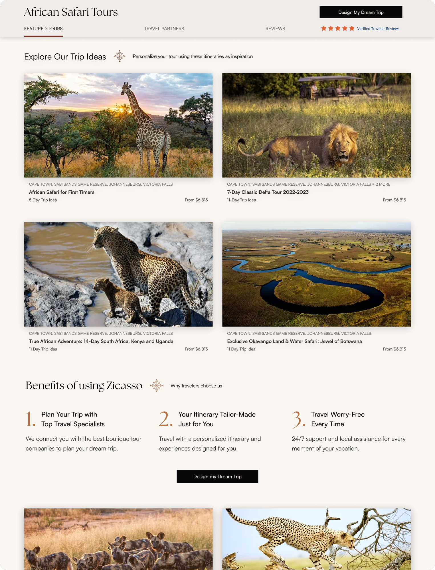
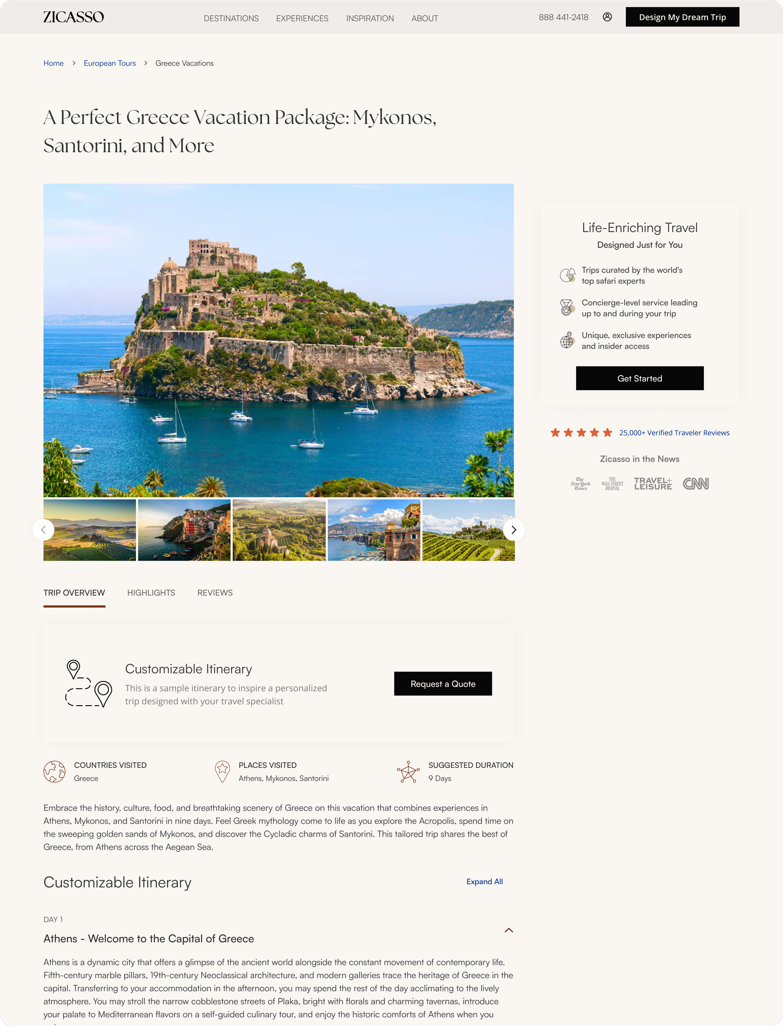
Every page except home and about brought in line with the new visuals, consistent with the 2.0 pages.
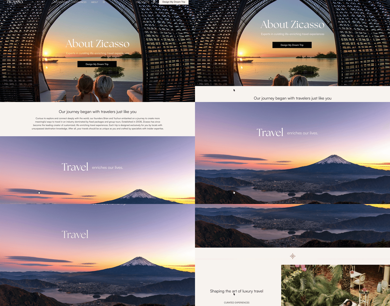
New components, new interface, new experience — starting with home and about, the pages covered here.
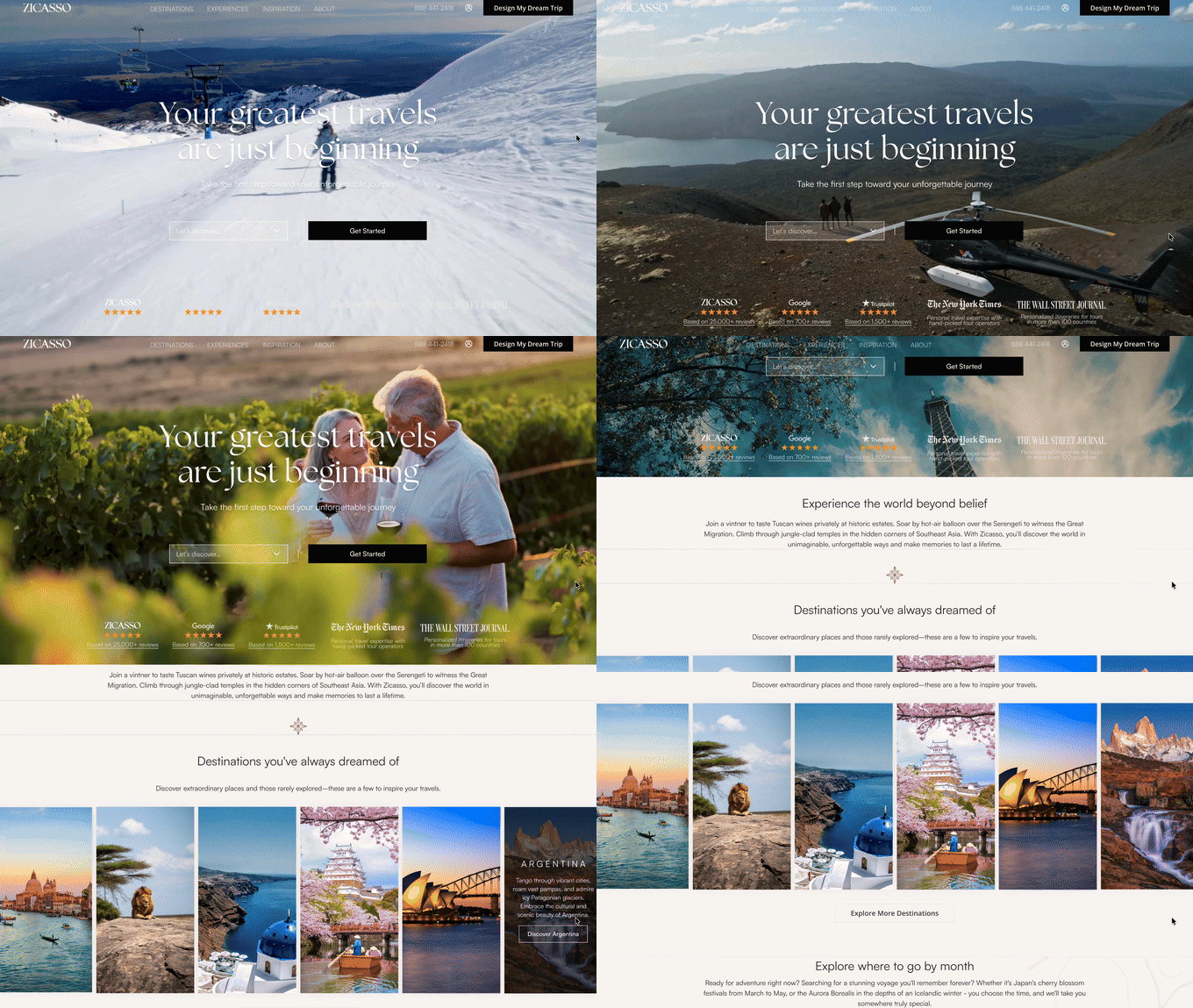
A/B tested across behavior sets: "Your greatest travels are just beginning" won on overall conversion. Backed by prior Unbounce tests too — hero video beat hero image on CTA clicks, and a short, central "Get Started" button outperformed longer, busier variants.
Users engage highly with sections that display social proof, including banners and review sections. The homepage leads with exactly that — ratings from Google and Trustpilot alongside features in The New York Times and The Wall Street Journal.
Selected by average commission, total converted commission, search volume, and trip-report mentions — one destination per key region, not whichever photo looked best.
Seasonal content is consistently high-engagement — in testing, "When to Visit" and similar seasonal modules kept attracting clicks, and search demand backs it up: "best time to visit Italy" alone drives 5K+ searches a month, with Iceland, Costa Rica, and Japan topping curiosity searches 8 months out of 12.
Categories drawn from 12 months of trip reports, ranked by how often each theme was actually mentioned — "Premier" and "Luxury" led, confirming what research had already shown.